

Matching event colors with rentals creates a cohesive and memorable atmosphere. Here’s how to do it effectively:
- Choose Your Color Palette: Base it on your event type, season, or venue features. Use tools like Adobe Color or Canva for inspiration.
- Review the Venue: Consider the venue’s architecture, lighting, and dominant colors to ensure harmony with your palette.
- Coordinate Rentals: Align furniture, tableware, and linens with your chosen colors. Use the 60-30-10 rule for balance.
- Layer Textures: Add depth by mixing fabrics, finishes, and materials. Balance smooth and rough textures for visual interest.
- Ensure Consistency: Audit all elements – rentals, décor, and signage – to maintain a unified look. Share swatches with vendors for accuracy.
How To Choose Your Wedding Colour Scheme | Wedding Planning Tips
Step 1: Choose Your Event’s Color Palette
Your event’s color palette sets the tone and defines its overall style. For corporate events in Charleston, consider using your company’s brand colors as a base. For instance, if your logo includes navy and silver, you could pair those shades with a complementary color to create a cohesive and polished look. On the other hand, casual celebrations might call for more vibrant hues like yellow, turquoise, or coral to create a lively and cheerful vibe.
Seasonal colors are another great option. Think soft pastels for spring, bold shades like coral, teal, and lemon for summer, rich tones like burgundy, orange, and forest green for fall, and cool colors such as navy, silver, or emerald for winter.
Don’t overlook your venue’s existing features, like wall colors, flooring, and lighting. These elements can significantly influence how your chosen colors appear. Always test your palette under the venue’s actual lighting to ensure everything works together seamlessly.
A good rule of thumb for building your palette is the 60-30-10 rule. This means selecting one dominant color to cover about 60% of your design, a secondary color for 30%, and an accent color for the remaining 10%. Balance everything with neutral tones like white, black, gray, or beige to keep the look cohesive.
To make this process easier, tools like Adobe Color, Coolors, or Canva Color Wheel can help you experiment with and fine-tune your palette. You can explore different schemes like complementary (opposite colors on the color wheel), analogous (colors next to each other), or triadic (three evenly spaced colors) to achieve the right balance and contrast.
"Color plays a valuable role in our daily life: it conveys feelings, changes actions, and influences every element of how humans view the world" – Figma.
Once your palette is set, it will guide every aspect of your event, from furniture and décor rentals to the smallest details. A well-thought-out color scheme ensures that every element aligns with your vision, creating a cohesive and stylish Charleston event. Next, dive deeper into how your venue’s features can complement your palette.
Step 2: Review the Venue and Its Current Features
Your venue plays a huge role in shaping your event’s color palette. Before signing any rental agreements, take the time to evaluate how your chosen colors will work with the venue’s existing elements. This step can make the difference between a design that feels cohesive and one that feels out of sync.
Start by focusing on the venue’s architectural features. Look at permanent elements like exposed beams, columns, brick walls, or large windows, and take note of their dominant colors. These features can serve as the foundation for your design decisions.
Take a detailed inventory of the venue’s colors and materials. Walk through the space and jot down details like wall colors, flooring types, built-in fixtures, and other permanent décor. Don’t just look at what’s on the ground – consider vertical elements like walls and ceilings. For instance, high ceilings might inspire dramatic styling, while lower ceilings call for a more intimate approach.
Lighting is a game-changer. Test your color choices under different lighting conditions. Daylight tends to make colors appear brighter and more vibrant, while evening lighting can soften tones and create a different mood.
Your palette should reflect the venue’s personality. For example, a historic Charleston venue with rich brick walls and dark wood accents might clash with a bold, ultra-modern color scheme. Instead, choose colors that enhance the venue’s charm. Neutral spaces provide more flexibility, but venues with strong architectural details shine when your palette works with, not against, their character.
Fine-tune your palette based on the space. Use lighter shades to brighten dark areas or deeper tones to add warmth to large, open rooms.
Let the venue’s dominant color guide your palette. The goal isn’t to mask the venue’s unique features but to create a seamless blend between your vision and the space’s natural beauty. When done right, your guests will feel like the colors were tailor-made for that location. This careful review sets the stage for matching rentals to your chosen palette.
Once you’ve nailed down the venue’s role in your design, you’ll be ready to align rental elements with your color story.
Step 3: Match Key Rental Categories with Your Palette
To create a visually stunning event, think of your rentals as layers – some form the foundation, while others add those finishing touches. The key is balancing these elements so your color scheme shines through without feeling cluttered. By aligning each rental category with your palette, you’ll set the stage for a cohesive and polished design.
Furniture and Lounge Areas
Furniture plays a big role in setting the tone of your event. Larger pieces, like lounge sofas, bar setups, or statement chairs, often act as the focal points for your color palette. For instance, if your wedding theme features sage green and cream, you could opt for deep green velvet sofas paired with cream cocktail tables to create an elegant, inviting base. A rustic outdoor event might lean into warm wood tones accented with burgundy cushions, while a sleek corporate event could use white furniture with bold navy accents. Mixing textures – like pairing a cream linen sofa with a leather chair in the same shade – adds depth and interest without overcomplicating the look. Be mindful of your venue’s size when arranging furniture to encourage natural movement and guest interaction.
Tabletop and Tableware
Your tabletop design is where your color story can truly come to life. Start by choosing dinnerware that matches the event’s vibe. For a formal setting, fine china with metallic details can add a touch of elegance, while matte stoneware in earthy tones works well for more relaxed, rustic gatherings. If you’re going for a modern look, minimalist white plates or geometric designs can provide the perfect backdrop for pops of color. Glassware is another opportunity to reinforce your theme – crystal stemware adds sophistication, while colorful tumblers bring a playful, casual energy. Flatware should complement your plates and glasses; mixing metals can introduce contrast, but keep it subtle to maintain cohesion. Begin with a primary color to ground your design, then layer in complementary hues and bold accents to create depth.
Linens and Décor
Linens and décor pieces are where you can really play with color and texture. Start with a base layer, like tablecloths or runners in your primary color, and build on it with accents such as napkins, overlays, or patterned placemats. For instance, pairing ceramic plates with linen napkins or adding a glass accent to a stoneware bowl can elevate your tablescape while keeping it harmonious. Décor elements like floral arrangements, centerpieces, and small accessories can subtly echo your color scheme throughout the space. Keep practicality in mind, too – light linens bring a fresh, airy feel to daytime events, while darker tones add drama and richness for evening celebrations. By carefully layering these details, you’ll tie together your furniture, table settings, and venue design into a seamless, unified look.
When every rental category works together to support your color palette, your event space will feel thoughtfully designed, visually striking, and effortlessly cohesive.
sbb-itb-bf73c46
Step 4: Mix, Layer, and Add Depth
Once you’ve matched your rental categories to your color palette, it’s time to elevate your event design by layering textures and materials. This technique can turn a basic setup into a visually dynamic and sophisticated space. The key is blending different shades, textures, and finishes while keeping everything balanced.
Start with a neutral base to create a flexible foundation. Neutral colors like whites, grays, and beiges are ideal for larger rental items such as tablecloths, lounge furniture, or drapery. They provide a calming backdrop that lets your accent colors shine without overwhelming the space. For example, a cream linen tablecloth can set the stage for burgundy napkins, gold charger plates, and textured runners in complementary hues.
Texture is your secret weapon for adding depth without overloading the color scheme. As Mary Kathryn McConaghy, Managing Director at Curated Events, puts it:
"Layering texture is one of the most powerful ways to create a multidimensional, visually rich event environment".
Combine smooth and rough surfaces, soft fabrics with structured materials, and matte finishes with reflective accents. A satin tablecloth paired with a jute runner instantly creates visual interest, while velvet lounge chairs next to sleek metal cocktail tables strike a balance between comfort and elegance.
Balance is everything when working with contrasting elements. Studio Sorores emphasizes:
"By layering a mix of contrasting textures within a tablescape and event venue, you will be adding more depth and visual interest, as well as providing some overall balance in your design scheme".
For example, if your bar features a smooth marble countertop, pair it with textured bar stools featuring woven seats. Glossy dinnerware can be balanced with matte napkins or rustic wooden chargers. This interplay of contrasts naturally enhances the overall design and highlights metallic details.
Metallic accents are the perfect finishing touch, bridging your color palette and neutral base while adding a touch of luxury. A simple white plate can feel elevated with a gold-rimmed glass, and copper chargers can bring warmth to a cool gray and navy setup.
Think in layers – both vertically and horizontally. Consider how textures and colors interact across the entire space, from the floor to the ceiling. Textured wall panels or drapery can complement smooth flooring, while layered lighting can draw attention to specific surfaces, enhancing the depth of your materials. Incorporating natural elements like raw wood, stone, or greenery adds an organic feel that balances elegance with a grounded, approachable vibe.
Use the rule of three to repeat your dominant color across various textures and intensities, creating a cohesive look. For instance, navy blue might appear in soft velvet lounge cushions, crisp linen napkins, and glossy ceramic vases. This repetition strengthens the color story you’ve built in earlier steps.
Finally, remember that lighting is crucial in showcasing your layered design. Different textures interact with light in unique ways, so think about how your venue’s lighting will play off smooth glass, rough burlap, polished metal, and soft fabric. By integrating these layers thoughtfully, you’ll achieve a cohesive and visually striking event design.
Step 5: Keep Color Consistency Across All Elements
This final step ties everything together. Building on the palette and textures you’ve established, maintaining color consistency across every detail ensures your event feels polished and intentional. From the first save-the-date card to the final table setting, a unified color approach creates a seamless, memorable experience.
Start by conducting a full color audit of all event elements. Go through each item systematically – rentals, printed materials, signage, and décor – to confirm your chosen palette is used consistently. For example, if burgundy is a key color, the napkins should complement the burgundy accents on your invitations, and gold charger plates should match the gold foil on your welcome signs.
To stay organized, create a master checklist that tracks color consistency across all components, such as linens, tableware, furniture, floral arrangements, signage, lighting, and custom décor. Akis Apostoliadis, a UX/UI Designer, emphasizes the importance of this step:
"Context in color matters. How you combine color affects people’s perceptions of your brand".
This idea translates directly to events – when colors are inconsistent, they can disrupt the carefully curated atmosphere you’ve worked so hard to create.
Share your color palette and swatches with every vendor to ensure everyone is on the same page. A florist, for instance, can use a physical swatch to select flowers that perfectly match your table linens. Since colors can look different on screens or under various lighting conditions, always verify with physical samples. During vendor discussions, consider how lighting at your venue might affect the appearance of your chosen colors and adjust accordingly.
Next, establish a clear color hierarchy for your event. Decide which elements require exact color matches (like table linens and key signage) and where complementary shades can be used for accents (such as throw pillows or secondary décor). This approach balances precision with flexibility, adding visual interest without compromising the overall harmony.
To avoid confusion, document your final color choices thoroughly. Include details about specific products, vendor names, and any custom color mixing involved. This documentation not only helps with last-minute adjustments but also serves as a reference for future events.
Finally, remember that color consistency isn’t just about matching hues – it’s also about how different materials and finishes interact. A matte burgundy napkin will look different from a satin burgundy ribbon, even if they’re technically the same color. Test these combinations in advance and make adjustments as needed to ensure everything works together seamlessly.
When every detail aligns, your event will exude sophistication and cohesion – a thoughtful design that guests will appreciate and remember long after the celebration ends.
How CHEERS Event Rentals Can Help
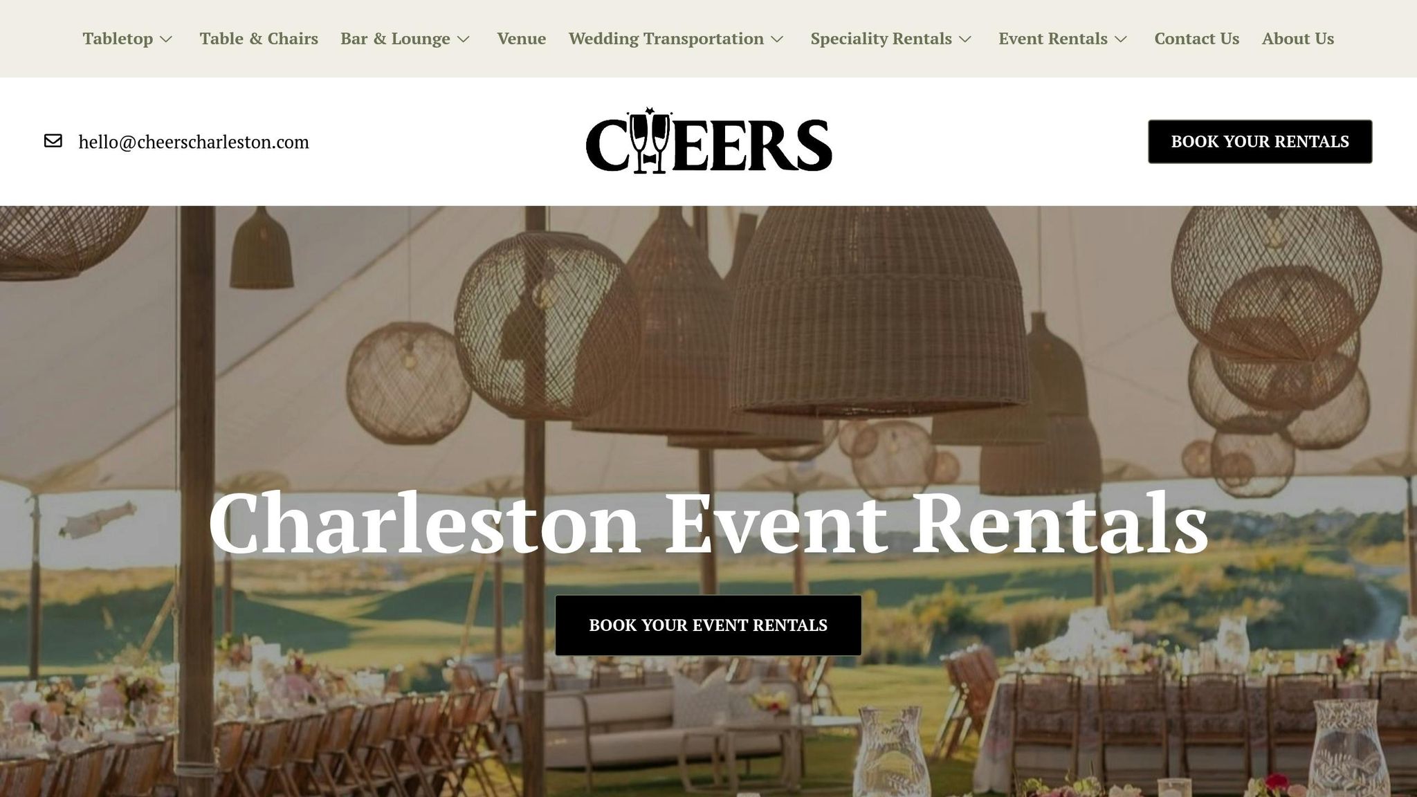
CHEERS Event Rentals takes the stress out of executing your event’s color scheme. Whether you’re aiming for a classic, modern, or bold aesthetic, they make it easy to bring your vision to life with perfectly coordinated pieces. Their focus on cohesive design ensures your event looks polished and seamless.
From gold-rimmed plates to burgundy linens and terracotta chargers, CHEERS offers the flexibility to mix and match tabletop items effortlessly. Their carefully curated inventory includes everything from elegant banquet tables and bamboo chairs to linens in key shades and tableware that complements any palette. It’s all about giving you the tools to create a stunning event.
What truly sets CHEERS apart is their personalized approach. They provide one-on-one consultations to help you select pieces that align with your color scheme. Need a clearer picture of how everything will look? They can even provide arrangement images to ensure every detail matches your vision.
For more elaborate events, CHEERS goes a step further by offering custom designs and exclusive pieces tailored specifically to your theme. And when it comes to logistics, they’ve got you covered. From delivery and setup to in-person showroom consultations, they handle the details so you can focus on your creative ideas.
Here’s what customers are saying about their experience with CHEERS:
"CHEERS made all of my Thanksgiving dinner party dreams come true! Their place-settings are stunning, and the service is top notch. They were so helpful with the setup and delivery process, making hosting that much easier. Codi is a pleasure to work with, and I highly recommend giving him a call to assist with your next event." – Mary Eudy
"CHEERS is a fabulous company specializing in boutique rentals and stylish charm! The company has excellent communication and every time I use them for rentals, the drop off, set up, and pick up are seamless! Highly recommend for your event needs!" – Sarah Corley
Conclusion: Creating a Unified Look with Rentals
When you bring all the design elements of your event together seamlessly, the result is a polished, professional atmosphere that leaves a lasting impression on your guests. By focusing on visual and thematic consistency, every detail – from furniture to tableware – works together to tell a cohesive story.
This thoughtful coordination transforms the guest experience. Whether it’s a corporate event, a wedding, or a cozy dinner party, aligning your rentals with your design vision ensures the space feels intentional and inviting. Plus, the effort you put into matching colors and styles pays off in every photo and every moment your guests enjoy.
CHEERS Event Rentals makes this process easier with their carefully curated selection of luxury and vintage pieces. Their personalized consultations and arrangement previews help you visualize and execute your color scheme flawlessly. From custom linens in your preferred shades to expert advice, they ensure your event design comes to life exactly as planned.
FAQs
How do I use the 60-30-10 rule to coordinate event colors with rentals?
The 60-30-10 rule is a straightforward method to design a well-balanced color scheme for your event. Here’s how it works: your primary color should dominate about 60% of your decor. Think larger pieces like tables, chairs, or lounge furniture. Then, your secondary color takes up 30%, which could include items like tablecloths or smaller decorative elements. Finally, reserve your accent color for the last 10%, adding vibrant touches with napkins, centerpieces, or flatware. This formula helps create a cohesive and visually pleasing setup for any event.
How can I make sure my event colors match perfectly across rentals, décor, and other elements?
To pull off a polished and visually appealing event, start by selecting a color palette with 2-3 main hues and a few neutral tones to complement them. A useful guideline is the 60-30-10 rule: dedicate 60% of the space to your primary color, 30% to a secondary color, and 10% to an accent shade. This approach helps create balance and prevents the design from feeling chaotic.
As you choose rentals, décor, and tableware, stay true to your chosen palette and think about how the pieces will work together in the venue. For instance, pairing bold tones with softer or neutral elements can keep the overall look cohesive. When setting up, take a step back to review the arrangement and make adjustments as needed to ensure everything aligns with your desired aesthetic.
If you’re looking for top-tier rentals to enhance your event, CHEERS Event Rentals has you covered. From vintage furniture to sophisticated tableware, they offer a variety of options to help you effortlessly bring your vision to life.
How can I select the best textures and materials to match my event’s color scheme and create a visually stunning setup?
To craft an event design that’s both visually striking and well-balanced, focus on textures and materials that align with your color palette while adding layers of depth. Combine various textures like soft fabrics (think velvet or linen), sleek surfaces (such as glass or metal), and natural accents (like wood) to create a welcoming and dynamic setting.
For an elegant vibe, consider using smooth finishes like satin or silk. Want to add a bit of drama? Opt for richer materials like velvet or textured tablecloths. By thoughtfully blending these elements within your chosen colors, you can design a space that feels cohesive yet lively – leaving your guests with a memorable experience.